Classic Mets

Lucas Duda, left, David Wright, middle, and Ike Davis will likely be the headliners for the Mets in these new, but classic uniforms in 2012.

Meet the Mets new uniforms … well, at least that’s what the team is saying.

The Mets will be celebrating their 50th anniversary this upcoming season, and what better way to mark the milestone than with new, well old, uniforms. New York will go back to the look of its inaugural 1962 season for 2012. (Of course that team had a record 120 losses.)

The biggest difference in the uniforms from the past decade is in the road uniforms.

In 1998, black was added as the third official Mets color to go along with blue and orange. From that time on, black dominated the road hat, whether it was accompanied by a blue bill or not. Now, the Mets will go with a blue hat on the road as they did prior to 1998, with the exception of one road game against the Yankees in 2008.

This is a fantastic move. Blue and orange should always be the colors of the Mets, the black uniforms never really felt like they belonged, although they will still be used as a road alternate in 2012.

The other adjustment from last season’s look is the loss of the drop shadow behind the lettering on the home jersey. Honestly, that drop shadow was only noticeable for the detail obsessed so the change makes the uniform cleaner, but is too subtle to make much of a difference.

As a a Mets fan, it is nice to see these changes. My favorite uniforms have always been the pinstripes with the blue hats, especially for day games. The more I see this uniform, the better. Hopefully, there will be some uniform karma transferred to the field for the Mets in 2012.

Week 9 NFL Review: When uniforms flop

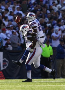
Marcell Dareus and the rest of the Bills might have had their moments on Sunday, but overall their white uniforms failed in a loss to the Jets. Photo by Getty Images

My apologies for the delay on this. Time constraints call for me to keep this brief, but more will come next weekend.

The Buffalo Bills tried to rally their team and their fans with a white out at Ralph Wilson Stadium on Sunday. For anyone who watched the game, it’s very fair to say, it flopped.

There was more emotion from the fans at the start of the game given this extra boost from a special uniform worn against a division rival.

However, since this idea did not work out as planned in a blowout loss to the Jets, it is likely the Bills will stay away from white at home for a while. Uniform karma could likely come back to bit the Bills if they continue to try something that hasn’t worked in the past.

A Bill friend of mine hopes to never see these again, and I will say I hope the Bills can turn things around as this season holds the most promise in a long time for the franchise.

What’s Maryland wearing this week? Week 10

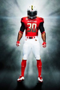
Maryland will go with a pretty conservative but sharp look on Saturday against Virginia.

As the Terps’ play on the field continues to decline (see their 2-6 record,) their uniforms continue to get better. Let’s be honest there was no choice after the Maryland Pride debacle.

This week, Maryland will host a resurgent Virginia squad in a uniform that look very similar to their old jerseys. The look is very clean. I believe “sharp” is the best way to describe  it.

The turtle shell helmet with the white pants looks very nice, and overall, it just might remind Maryland fans what a football uniform actually looks like.

In other uniform news, Ohio stepped outside the box for a Wednesday night ESPN game. The MAC is loving the NBA lockout the most considering all the national TV time they are getting because of it.

The Bobcats had a striking resemblance to Hawaii with the designs on the shoulders. Overall, I was left feeling uninspired by the uniforms, nothing special really.

Week 8 NFL review: Color coordination

All of Reliant Stadium got into the red act for the Texans victory over the Jaguars on Sunday. Photo by Getty Images

This week’s action in the NFL was a rare instance of more excitement with uniforms than their college counterparts.

It starts with the Houston Texans who used their alternate red in a victory over the Jacksonville Jaguars. The best part of this was not the jersey itself, but the fact that the rest of the stadium went along with this red revolution.

Houston must have gotten the word out to its fanbase of the uniform change because just about every fan in Reliant Stadium was going right along with their Texans in their red jerseys. Even the end zones had a red shadow to the letters instead of the usual blue.

Other teams, like the Jets, go with their alternate uniforms without changing anything else about their surrounding area. The Texans got it right in this case with a total feeling of red throughout Reliant Stadium.

The look isn’t good or bad, but just average. I prefer the normal blue uniform to this red look, but was very happy to see the rest of Houston going along with their team in the alternative direction.

Usually this color coordination is seen in the NHL and NBA playoffs. It seemed like just about every team in the NBA decided to go with this cool television effect this past postseason. The Heat are known for their white outs including the white drapes over the empty courtside seats.

With that, time for the quick hits:

A.J. Feeley and the rest of the Rams looked good and played even better against the Saints on Sunday. Photo by Getty Images

  • The Rams went back to their glory days in the uniform department and on the field as they went to throwbacks for an upset of the Saints. These uniforms are the best the Rams have ever worn, it was great to see them used again.
  • Carolina continued to employ its powder blue home jerseys. It makes me wonder if these have become the primary uniforms for the Panthers.
  • The Broncos also went with their alternate orange uniforms. The orange harkens back to the Orange Crush and John Elway days. The look is a bit jarring at first, but I think it definitely works for Denver.

Week 9 College football review: What to wear

Oregon went with a yellow-on-black look in a victory over Washington State on Saturday. It was a look not yet seen this year, but used against UCLA last season. Photo by Getty Images

Outside of Ohio State’s pro combat uniforms in an upset victory over Wisconsin that we will get to later, the uniforms in college football were pretty standard on Saturday.

Therefore, we’ll take some time to go over the pioneers of this uniform revolution, Oregon.

We all know how how Oregon had come since its plain green-and-yellow look to the safety green that made a splash in last season’s national title game. At first all their uniform changes were viewed as corny and a stunt, but now they are the pioneers of a great recruiting tool that has seen the Ducks rise to national prominence on a consistent level.

One thing that I always wonder with Oregon is what their fans wear to games. We’ve come a long way in fan apparel since the days of fedoras and suits in the stands. The standard look for a fan at any football game now is a jersey of their favorite team.

With all the looks Oregon employs, how can a fan of the Ducks know exactly what to wear as they head to Autzen Stadium. It’s neat to be wearing the same thing as the players on the field, but for Ducks fans, it is more of a crap shoot to see if you can actually accomplish that feat.

On the flip side, it also gives fans an opportunity to show their favorite color of the Ducks. They are not restricted to just one jerseys, but literally dozens. Must be fun (and a little confusing) to be an Oregon fan.

Now back to the Buckeyes and our quick hits:

Quarterback Braxton Miller and the rest of the Buckeyes performed well in pro combat uniforms on Saturday. Photo by Getty Images

  • Ohio State had one of the more unoffensive pro combats for their upset of Wisconsin. A friend said earlier in the week the helmets look similar to Georgia’s from Week 1, which is true. However, the colors of the jerseys and pants look like the Buckeyes. It was a pretty good look.
  • Rutgers again went with an all-black look in a snowy loss to West Virginia. I think they might have gone with these black uniforms to stand out from the white field. Either way, I’m looking forward to the Scarlet Knights actually going back to being Scarlet when they take on Army this week at Yankee Stadium.
  • Oklahoma State finally went with orange uniforms at home, but ruined the look with gray helmets and pants. Maybe they are waiting for the key Bedlam games against Oklahoma to get it right.
  • Virginia Tech looked a bit like the Cleveland Browns in a victory over Duke.
  • Kentucky and Mississippi State changed things up a bit. Kentucky wore these odd all-black with blue accents. While the Mississippi State wore a matte finish to their usual helmets.

Week 7 NFL review: Ho-hum

Sunday’s NFL slate was billed as one of the least exciting of the season, and it lived up to the hype. While Tim Tebow might have led another fourth-quarter comeback in Miami and the Jets and Chargers entertained us for a bit early on, it was a good thing the World Series was on that night.

The lack of excitement on the field was matched in the uniforms department. With that said, we will immediately move to the quick hits:

Jonathan Stewart and the rest of the Panthers had a very good day against the Redskins in these light blue alternates. Photo by Getty Images

  • The Panthers went with their alternate light blue jerseys in a victory against the Redskins. This look works and certainly brings out the light blue outline on the silver helmets. It also matches another football team that plays in North Carolina.
  • Minnesota chose a throwback look for the second time this season in a close loss to the Packers, which is always nice to see.
  • The Saints dominated the Colts in white at home. I had a sneaking suspicion New Orleans might go this route before the game, but was hoping it wouldn’t be right. There was certainly no getting in the Saints way as their offense soared and Drew Brees ruined my perfect record in fantasy football.

Helmets like White Elephants

Here we have another entry from Alex. This one regarding the emergence of white helmets in football.

Auburn has employed the white helmet for a long time. Always looking good at home and on the road.

But if I do it, then it will be nice again if I say things are like white elephants, and you’ll like it?”

– From “Hills Like White Elephants” by Ernest Hemingway

Indeed, there was a time, particularly in pro football, when white helmets were considered a white elephant, or rather, a fashion faux pas. When the Houston Texans were born in 2002 and they introduced white helmets, many alleged “experts” bristled at such a uniform statement.  Arguably, an expansion team should have made a better impression on the league with a better helmet idea, or could have actually made the playoffs once in their first nine seasons.  With neither feat accomplished, perhaps the Texans were on to something with their white helmets. Today, the trend toward the white helmet, in the NFL and even more so in college, is quite prevalent.

More and more teams have gone to the white helmet because it offers that classic look. With the constant uniform changes happening in college football, many teams have either opted to keep or have opted for the white helmet. This weekend, LSU, wearing their not-as-deplorable-as-it-could-be Nike Pro Combat looks, opted for a white helmet with purple “LSU” on each side, went up against Auburn in a rare white helmet vs. white helmet matchup.

Also this weekend, Oklahoma State, in their victory over Mizzou, looked good with an all-white getup that included white helmets.  A revisit to the Oklahoma State Combo Creator reveals that OSU, in addition to their gray and black helmets, actually have two white helmets, one that features an orange “OSU” and another that features that same logo in black.  Of course, OSU has always had white helmets, but it was nice that, when they did decide, for whatever reason, to redo their football unis, they kept those two white helmets, rather than discarding for something that looks like this.

Barry Sanders sported a white helmet with Oklahoma State in the late 80s. The letters on the helmets were bigger, but the helmet has largely remained the same.

Like the Cowboys, many schools have had white helmets as far back as anyone can remember, making the white helmet not a burden to an team’s look, but rather an enhancement. Penn State and Stanford have never deviated from their white lids (although Standard will feature a black helmet on November 27th, when they Pro Combat for a primetime game against Notre Dame). Many other schools have also gone to the white helmet in recent years, with even Oregon finding room in their cornucopia of unis for a classic, white topper.

But this trend is not only limited to the college game. In addition to the Texans, the Jets, Cardinals, Dolphins, Colts, and Titans (formerly the Oilers) all sport white helmets. Additionally, both the Bills and Chargers have made the move from their old helmets to white helmets.

Clearly, the white helmet is (and has) made a comeback.  And, rather than being like white elephants, are embraced by teams looking to return to a more classic, and overall better look.

World Series preview: Searching for an identity

Please welcome our second contributor, Tim. While he’s not painfully enduring following Mets games while working at Fenway Park, he’s coming up with astute observations on uniforms. He’s an authority on baseball, hence, here are his thoughts on the aesthetics of the upcoming Fall Classic.

Cardinals closer Jason Motte has continued St. Louis' success this postseason, and it has come in the classic look of the birds on the bats. Photo by Getty Images

The Cardinals and Rangers will meet tonight in Game 1 of the World Series. It will represent a clash of organizations that have very little in common. St. Louis has been around since the 1800s, and it is the most successful National League franchise—both ever and recently. Texas has existed only since 1972 and has never won a Fall Classic.

In terms of uniforms, however, the teams display many similarities. But it’s their differences—however subtle—that illustrate important concepts of uniform design, identity, and tradition.

The Cardinals have one of the best and cleanest looks in Major League Baseball. The birds perched on a baseball bat across their chests has become iconic; it’s been a part of their uniform since 1922 (with the notable exception of 1956). Since then, however, their uniforms have pretty much been the same, give or take some cool stirrups here and there, the inevitable pullover- and light blue-ization of the uniform in the ‘70s and ‘80s,* and the way St. Louis went all Volstead Act on the concept of front numbers in 1979-80.

*I don’t know about you, but that Major League Baseball teams still wore pullovers as recently as 1992 seems very weird. In a way, the full-fledged re-adoption of button-downs in MLB marks the stylistic end of the ‘80s, no?

Like the Rangers, the Cardinals have experimented with both red and blue. While the letters and outlines on their jerseys have always been red, the Cardinals have often worn navy caps, beginning in 1940. For nearly a quarter-century, they only wore navy caps, until the current red-at-home, navy-on-the-road model was adopted in 1964—a good year in St. Louis. It lasted only that season—much like Yogi Berra’s first tenure as Yankees manager—before disappearing itself for 25 years, with the Cards wearing only the red hats. The road navies reappeared in 1992 along with button-down jerseys. The uniform has not changed since.

Michael Young and the rest of the Rangers reached their second straight World Series in this puzzling two-toned look for home games. Photo by Getty Images

The Rangers, meanwhile, do not possess nearly the same pedigree as St. Louis, either as a franchise or in their uniform styling. Texas has had five different logos in its relatively brief 40-year existence; the Cardinals, on the other hand, have had seven in 110 years. The Rangers have therefore struggled to forge a consistent identity. Their first uniforms went with an old-time Western font that included lowercase lettering—something very rarely seen in non-cursive wordmarks.* They had an anomalous 1983 with a weird “TR” logo never seen before or since. The Rangers wore their first tenable uniforms in 1986 before overhauling their look in 1994. The overhaul was very much welcome; the old, flat T was replaced by a beveled one that is, in my estimation, the best T in all of sports.

*Think my use of “rarely” is unmerited? The Twins are the only current MLB team to employ this style of wordmark; in the past, the Astros, Padres, and Angels are the only squads to have done it (that I can think of). It’s not even common in other sports. The Steelers are the lone football team with lowercase print in their wordmark. The Red Wings and Capitals do it in hockey. It has a bit more currency in the NBA, dating back, I think, to the Blazers and Bullets.

The Rangers also switched to red in 1994, a move that seemed welcome at the time but which has caused all sorts of quandaries ever since. Starting in 2000, Texas has bounced back and forth between red and royal before settling—sometime this season, I believe, although it could have been last—on wearing red hats at home and royal ones on the road.

You’d think this is pretty much the same thing the Cardinals do, and thus it should be celebrated. The problem, though, is that the Rangers’ red hats don’t in any way mesh with their home white jersey, which still has royal font (with red outline). The resulting look isn’t clean. Now, if you want to say that the Cardinals’ roads pair a navy hat with a jersey with red lettering, well you’re right. And it’s not clear to me if the reason this looks fine to me while the Rangers’ homes don’t is some sort of traditionalist bias (unlikely, just because the new Nationals’ uniforms look good doing the same thing) or the apparent fact that navy and gray intrinsically go together (they certainly do to me; pretty much everything I wore in high school fit that color scheme).

Cliff Lee led the Rangers last season when they stuck with blue-on-blue as their primary home look.

Now, to answer the obvious “How do the Rangers fix this?” question, we have some preliminary, theoretical ones to address. First, how important a role does a team’s uniform play in its identity? Second, is carrying on a two-toned identity feasible, let alone preferable? If it isn’t, what color are the Rangers?

My answer to the first is, almost everything. Your colors are your colors,* and it’s very difficult to up and change them after an identity has been forged. That’s why the Rangers could go to red in the first place; they had never made the playoffs. The Diamondbacks can get away with going from purple to red; the first look never worked anyway. But it’s a lot harder for the Atlanta Hawks to go from red to navy, the Denver Broncos to go from orange to navy, or the Utah Jazz to go from purple to navy. Fan reaction, both regionally and nationally, is typically strong, eventually resulting in a reversion to the old look. All three of those franchises have gone back, Jack Shepard-style.

*Imagine me placing extra emphasis on the second “colors” here, similar to EA Sports’ “If it’s in the game, it’s in the game” motto; that might get the point across.

And so I think we’ve established the significant tie between a team’s primary color and its identity, and that’s what makes the Rangers’ two-tonedness so unappealing. The Cardinals can get away with navy hats on the road; their uniforms are still primarily red, and they have been for 110 years. Their chromatic identity is secure. The Rangers, on the other hand, don’t have that track record. Although they have been blue far longer than they’ve been red, the Rangers first rose to prominence when they switched to red. Their first three postseason appearances came when they were red.

That’s what makes the last question—what color are the Rangers?–impossible to answer. They aren’t red or blue; they’re both, in which case they’re neither.

The solution, then, is for Texas to embrace royal blue. Ditch the red hats and the red alternates entirely; ditch the blue alternates, too, but less for identity reasons than “These are ugly” reasons. Although the franchise’s first run of success came in red, it can now be disregarded, as it is no longer its only run of success (or its most successful period). As the Rangers continue on the franchise’s golden age, it should be in royal blue.

Week 6 NFL Review: A Bold Move

Tom Brady found his rhythm late in white at home to beat the Cowboys on Sunday. Photo by Getty Images

Week 6 in the NFL brought much more uniform action than usual. We saw everything from throwbacks to alternate jerseys to a white jersey at home from a team that never does and a team wearing colors, that never does.

We’ll focus on the Patriots choice of white at home to force the Cowboys into their bad luck blues. While the Patriots seemed to be thrown off by the switch for much of the game, Tom Brady finally acclimated to the new threads in time to lead a game-winning drive in the game’s waning moments.

It was truly a bold move by the Patriots to go with these white uniforms at home. The news came out earlier in the week that this would happen, and it would be to force to Cowboys into their road blues they have not worn in quite some time. As a Giants fan, I was in favor of this move, but I hope it does not become a trend among other teams in the NFL.

The Cowboys road blues use a much darker blue and feature a star on the sides of the shoulders, a feature not seen in the usual home uniforms. They are certainly ugly uniforms and I understand why the Cowboys try to avoid wearing them at all costs.

The Patriots uniforms are nice, pretty much a typical road jersey. New England could have also gone for a silver look they wore a few times in their past, and still forced the Cowboys to go with their blue uniforms.

With that, we’ll move on to a busy quick hits:

James Starks joined the Acme Packers on Sunday in a helmet that was trying to simulate leather helmets of old. Photo by Getty Images

  • The Packers wore a 1920s throwback against the Rams on Sunday. The brown helmets are supposed to simulate a leather helmet the team wore back in the day. However, it ends up looking more like a Notre Dame uniform. The numbers in the circles are very strange, but I guess that’s what they did back in the 20s.
  • The Bengals wore an orange alternate against the Colts. They are not as good as the usual black uniforms, but not all that offensive since the helmet is also orange.
  • The Falcons wore a very nice throwback in their victory over the Panthers. I love the red helmet along with the black jersey. It’s probably the best look Atlanta has ever worn.

Week 7 College football review: Spartans and bumble bees

Michigan quarterback Denard Robinson couldn't overcome Michigan State and their new uniforms on Saturday. Photo by Associated Press

The biggest splash in college football uniforms came right off the bat on Saturday. As soon as Lee Corso picked Oregon to defeat Arizona State, ESPN switched to the Michigan-Michigan State game. We’ve known for a long time the Spartans would use a UAB-type look for this game, but Michigan’s throwback look came as a surprise.

The coolest thing about Michigan’s throwbacks was they didn’t warm up in them. The Wolverines were in their usual road unis before that feature maize pants before changing to the 1970s throwbacks for the game in East Lansing, Mich.

I’ll start with Michigan. I was hoping before the game they would go with something similar to the heritage uniforms they wore against Notre Dame in Week 2. The difference here is maize as the prominent color on the shoulder stripes instead of the blue, the number replacing the M on the front of the jersey and no stitch details on the numbers.

It’s a pretty solid look overall. The big numbers on the back of the jersey work well as do the small numbers on the helmets that don’t get in the way of the helmet design.

The only thing that bothers me with these uniforms is the Wolverines basically look like bumble bees. The prominence of maize on the stripes gives off that illusion, and since they are at the shoulders they are always seen by the fans.

Now on to Michigan State.

The Spartans looked totally unrecognizable for this game. The usual green and white combination for home games was totally thrown out for this rivalry game against Michigan.

The color scheme is very similar to that of UAB for home games. Overall, the colors do work together well, but they are not Michigan State’s colors. The gold helmets that had a bit of tint to them in certain places look like real Spartans (since I am clearly familiar with the men of Sparta, Greece.)

Moving on from the state of Michigan, here are your quick hits:

Oregon's Bryan Bennett stepped up for Oregon in a relatively conservative uniform game for these the Ducks and Arizona State. Photo by Associated Press

  • The last game of the night was a uniform special as Oregon and Arizona State faced off. The Ducks’ uniforms were average, nothing too special. Arizona State also looked pretty conservative with their maroon helmets and pants for a road game.
  • Virginia donned some nice orange and blue uniforms for their upset victory over Georgia Tech.
  • I’m still waiting for Oklahoma State to wear white helmets with orange. Their black-on-white-on-black look this week was just all right.
  • Washington State went with an all-gray look against Stanford. The Cougars have been down for a long time, so I guess they were trying to get hyped up for this one. It didn’t work.