Rutgers looking more like Knights

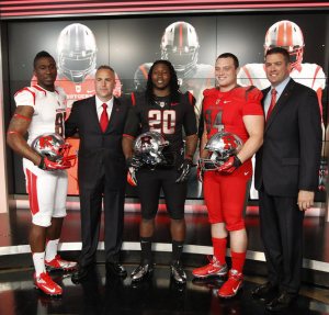
Rutgers football will have a brand new look this upcoming season. It is a move toward looking like the Scarlet Knights they are named after. Photo by The Star-Ledger

Over the past few seasons, Rutgers football started to cause a stir in the uniform world with some black alternate jerseys, but Tuesday, the Scarlet Knights took it to another level.

Rutgers showed off their new threads in a televised uniform reveal in the SNY studios in New York City, and they’re significantly different than anything they’ve worn before.

Director of Athletics Tim Pernetti explained the uniforms as a move to look more like knights. Without that explanation, you might think it looks like Rutgers is ready to jump in a spaceship and head to the moon.

The silver helmets might give the opponents a hard time during day games because of the intense reflection of the sun. They’re supposed to look like the helmets of knights, and with that explanation, the helmets are not as offensive as first thought.

The primary problem I have with the helmets is the thick stripes that go over the top of the helmet. They’re unnecessarily huge and have become the trademark of these new Nike college football uniforms.

The uniforms themselves aren’t  too bad. I like the all-white for road uniforms and all-red for the home garb. The numbers bother me a little bit just because silver numbers can become distracting while watching games.

It should be interesting to watch these uniforms in action this fall.

Here’s a full photo gallery of the uniforms courtesy of The Star-Ledger.

Rare Yankees Throwbacks

The Yankees will wear these 1912 New York Highlanders uniforms today at Fenway Park. Photo by New York Yankees

Today, the Red Sox and Yankees will mark the 100-year anniversary of Fenway Park’s opening, and they will do it in appropriate fashion.

While the Red Sox have sported ancient throwbacks in the past (like last season against the Cubs), this change is a very rare thing for the Yankees.

Since the Yankees became the Yankees in 1913, they pinstripes have been a staple of the uniform, giving them no alternate or even throwback to go to like most of baseball these days. Now, the Yankees will dress as the New York Highlanders, and don the 1912 throwbacks for this momentous occasion in Boston.

The uniforms themselves are pretty standard, and that’s a good thing. Baseball was simple back in those days (at least that’s what I hear), so it’s always fun to see guys like Derek Jeter and Jacoby Ellsbury dressed more than a little differently for a game.

The Star-Ledger’s Marc Carig even provided a little history on the Yankees’ throwbacks for this afternoon, and why the team has been so hesitant to use them for so long.

Nike takes the NFL

Nike's Todd Van Horne and the Seahawks' Kam Chancellor helped usher in a new era of Seattle's uniforms at the big Nike reveal yesterday. Photo by the New York TImes.

Now that we’ve had some time to let the Nike uniform revolution wash over us for a day, it’s time to settle down and think about what the NFL will look like come September.

In reality, there is not too much to get excited about here. The changes aren’t as dramatic as many thought they would be considering Nike’s history with crazy uniforms.

For the most part, teams will be changing their collars a bit to accommodate the flywire collars that became a trademark for Nike uniforms during last college football season. I never really understood why these collars needed to be used, but it seems to be a characteristic Nike likes to use for their uniforms.

The one team that went over the edge with their uniforms was the Seattle Seahawks.

There must be something about the Pacific Northwest that inspires teams to go for crazy uniforms, but it all started with Oregon and is now making its way to Seattle.

My biggest problem with Seattle’s news uniforms is the fact that there is just so much going on with them. I am usually in favor of intricacies to the uniforms, but the Seahawks take it too far.

The shoulder pads alone have at least four features to them, it’s impossible to keep track of all that as the game is going on.

The font on the numbers is pretty weak, it makes the uniform look too much like a college team. However, upon closer inspection, you can see the numbers have a pattern on them, but unless you are tackling Marshawn Lynch, it might be tough to notice that.

One feature I do like on the Seahawks new uniforms is the same pattern along the pants. I always thought the Seahawks pants were a little simple and could have used an extra stripe. Now, they have added that despite ruining the rest of the uniform.

Here is the photo gallery the Seahawks posted if you’re interested in exploring the new uniforms any further.

NCAA Propaganda

One of my favorite parts of watching the NCAA Tournament is the ability to tune into action going on across the country at one time. Now that there are four networks that stagger the starts of the games a bit, there is not the same simultaneous madness there had been in years past.

While the staggered starts actually work to the advantage of the fan because of the loss of cut-ins and the viewer now gaining the choice of what to watch, the madness has been cut down because of the uniform courts in each arena where the tournament is taking place.

For the past few years, the NCAA Tournament court has become a very bland and boring design.

Basketball courts are all inherently the same. They have to be the same distance, the 3-point line is the same, there’s not much room for creativity. However, the NCAA has taken out all the character of the courts with their uniform design.

It makes for a more confusing viewing experience over the first two rounds. When switching from game to game, the viewer loses track of what exactly they are watching because the courts and arenas for that matter have lost all their distinguishing features.

The NCAA strives to make the various hosts arenas into typical gyms with no distinguishing features when the tournament comes to town. It makes it seem very sad and semi-tyrannical. Part of the fun of the tournament for me is seeing all the different arenas and now stadiums across the country.

As things move on to the Final Four eventually, we will see a different logo in the middle of the court at the Superdome, but besides that, get ready for more of the same when watching games.

March Madness Rave Party!!

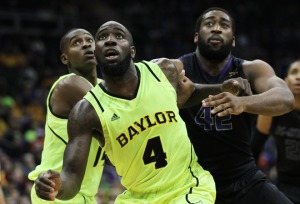
Baylor forward Quincy Acy looked like someone took a giant highlighter to his uniform for Thursday's game against Kansas State. Photo by Getty Images

Adidas decided to add a little more madness this March.

Starting with the conference tournaments and on through the NCAAs, three teams will look like they belong among black lights and glow sticks rather than the basketball court.

Louisville, Cincinnati and Baylor all debuted neon uniforms made by Adidas during their conference tournaments this week. While all three are pretty stunning to the eye, Louisville and Cincinnati come nowhere close to the stunning uniforms Baylor used Thursday against Kansas State.

The Bears started causing a stir in the uniform world during football season, but nothing compares to the highlighter uniforms that stunned the crowd in Kansas City.

Louisville had the least noticeable neon in a victory over Seton Hall Wednesday night. The lettering on the uniform was the biggest shock. Cincinnati turned some heads with its bright red shoes and loud piping in a Big East quarterfinal against Georgetown.

Overall, the uniforms aren’t the worst things in the world, and it’s good to see a bit of a stir caused from the college basketball world.

A few more golf notables

Ian Poulter has found a way to shine on the golf course without winning a major yet in his career.

With a little more research at the prompting of some of my co-workers, there’s in fact a few more golfers who have made a splash on the golf course, and not with the the one-stroke penalty.

Back in the day, a fellow named Doug Sanders was known as the “Peacock of the Fairways” for his eccentric wardrobe. Sanders played primarily in the 60s and 70s, and used some of the same loud colors Rickie Fowler uses on the golf course.

Overall, Sanders’ dress wasn’t as eccentric as some of the modern golfers, like Fowler, who have decided to shake things up. There are two players from the 90s and 2000s who immediately come to mind.

Jesper Parnevik, who might now be known as the guy who introduced Tiger Woods to his ex-wife, always wore his hat in a most interesting fashion. I never understood why the Swede decided to flip up the bill on his hat, wouldn’t that defeat the purpose of a hat by letting the sun in his eyes.

Parnevik also wore some nice neon colors on his sweaters and pants while out on the course, however, he never really got the following that others have seen since he wasn’t exactly a star on the PGA Tour.

Iam Poulter has also gotten his name out there with more than just his golf game in recent years. The English golfer, who was also one of the first athletes to take to Twitter, has shown his national pride (among other tributes) with the patterns on his pants.

Poulter has the personality to go along with his eccentric dress, making him one of the most popular golfers worldwide. Just ask his 1,247,310 followers on Twitter.

Spring Fever

Rickie Fowler has made a splash in the golf world with colors similar to water. Photo by The State Press

So now that we have moved on from football, baseball is starting to come into focus, the NCAA Tournament is on the horizon and the NBA is moving along at a fever pace this season, I have to find something to get back in the blogging mood with a short entry here.

For that, I’ll turn to an unlikely source … the golf course.

It’s not often you see a golfer make much noise in the sports fashion world, outside of when John Daly is feeling like he needs to cause a bit of a stir. But in recent years, Rickie Fowler has come along with some vibrant colors to add some spice to the typical round of golf.

With his signature bright orange as the primary color on Sundays, Fowler has been able to establish his name through his interesting color selection and ever-improving golf game.

One thing to really like about Fowler is his color coordination out on the gold course. If he isn’t wearing one solid color from head-to-toe, he can find the right accents to bring out whatever vibrant color he is going with that round.

Maybe it’s the surfer-dude haircut, but Fowler is able to pull off a look like would make Phil Mickelson look like a giant orange. The 23-year-old Fowler’s also become one of my favorite golfers to watch on the tour because of the different attitude and look he brings to the golf course.

Pomp and Circumstance of Super Bowl XLVI

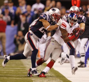
Mario Manningham made the key play for the Giants in Super Bowl XLVI on Sunday. Photo by Chris Faytok/The Star-Ledger

First of all, I’d just like to apologize for my absence on here in the last week. With the Giants in the Super Bowl and their subsequent victory, I’ve spent most of my time involved in the coverage (and celebration) of that.

The Super Bowl never looks like any other football game. Although the game is always played at a stadium used throughout the NFL season, like Lucas Oil Stadium this season, the setting does not resemble that of an ordinary game.

The most glaring aspect of the field that differentiates it from the norm is the end zones. Each teams gets a distinct design in an end zone, which to me is one of the most exciting aspects of the Super Bowl (when my team is not playing in the game.)

The middle of the field now features the NFL shield with the plain Super Bowl logos on the 25-yard line.

Perhaps the biggest difference from the regular season is the huge crowds on the sidelines. From the photographers, to friends and family, to the lucky people that get a spot on the sideline who have nothing to do with either team. The sideline on the Super Bowl is insanity.

Sports Illustrated spliced together photos of Lucas Oil Stadium this Sunday to create this very cool pan shot. Have fun with that, I did for about a half hour.

The Super Bowl’s Super Art

Here is another installment from Alex. As we count down the Super Bowl XLVI, we’ll talk a bit about the biggest game in America. Starting with this on Super Bowl logos and program design.

The NFL now only uses this standard logo for the Super Bowl with just the stadium on the bottom of the Lombardi trophy changing.

One of the overwhelming problems in our society (among many many others) is the complete and total absence of creativity. Reading Walter Issacson’s definitive biography about Steve Jobs, I get the sense that Jobs (like him or hate him) was an innovator, an individualist, and overall the Thomas Edison of our time. But what if he had been average, making generic, rather than cutting edge, technology? In other words, what if he followed the lead of the NFL with respect to its Super Bowl logo?


One of my earliest memories of the Super Bowl was the ticket/program cover art and logo for each Super Bowl.  More so than the logos, the ticket/program cover art was unique to the specific Super Bowl, and many times, unique to the host city.


Last year, before Super Bowl XLV, the NFL announced that it was formalizing the Super Bowl logo. After sampling what I’m sure were thousands of designs, the NFL went with the least imaginative. No color, no design, no thanks. The program cover art, starting with XLII follows a similar pattern. So, we’ll do what we always do on this website: look back to the past, but this time, at the best Super Bowl logos and cover art.


While the way I evaluate logos is completely subjective, my criteria for the cover art is more specific: I look at the imagination of the design, as well as how it incorporates the Vince Lombardi trophy with the host city. First the logos:

  1. XXXIII – Love the how the logo is a marquee.  You get a real vintage Miami vibe.
  2. XXXVII – A crummy game but I am a sucker for the lighthouse.
  3. XXXIX – Jacksonville was a terrible host city, but working their famous bridge into the logo was cool.
  4. XXXVI – An excellent tribe to America just four months after the 9-11 attacks.
  5. XXVII – Perfectly understated featuring the three roses.

Honorable Mention: XXVIII – Love the blue ribbon wrapped around the peach

Now cover art:

  1. XXIX – A perfect blend of old Miami, featuring a Model T in front of a hotel, tropical colors, and the Vince Lombardi Trophy towering among palm trees.
  2. XXXV – Even though my team was on the losing end of a blowout, I love the nautical theme. In addition to the Florida-host-city-standard of the Vince Lombardi trophy among palm trees, the sailboats and cloudy sky against the Tampa backdrop is nothing short of picturesque.
  3.  XXVII – I love this cover for a number of reasons. First, Pasadena is my favorite host city (a complete lack of luxury boxes at the Rose Bowl ensures the Super Bowl will never return) and the colors are outstanding. The sky features four colors: midnight blue, pink, orange and yellow, perfectly symbolic of the setting California sun. These colors, along with the blimp and fireworks, capture the excited and anticipation of the Super Bowl.
  4. XVII – Pasadena again. I also like the similarities between this and XXIX.  XVII features again features a marquee and the uniqueness of the colors gives the Vince Lombardi trophy a blue color.
  5. XVIII – What can I say? I’m a sucker for animals.

Honorable Mention: XXV – This is very similar to VI. It features the helmets of all the past Super Bowl winners, and a ton of vintage memorabilia for the silver anniversary Super Bowl. A nice tribute to Pete Rozelle, and the American flag is a subtle reminder of the nation’s involvement in the first Gulf War.


Will we ever see these designs again? Not unless the NFL has a stroke of nostalgia.
Madness in the NBA

The Grizzlies were appropriately fumbling a bit when they dressed as the Memphis Tams on Thursday night. Photo by Tri-City Herald

Now that the NBA has gotten into full swing, the Association decided to start getting a little wild in the uniform department, and it all began with the premier franchise for the last season and a half, the Miami Heat.

As I blogged about before, the Heat went with a plain-and-simple black and white look against the Lakers. They also went for that look against the Bulls on Sunday afternoon.

Then the Heat kept up the uniform changes with this crazy Miami Floridians throwback that seemed better suited for the set of Miami Vice rather than a basketball court.

But the topper came on Thursday night when the Los Angeles Clippers and Memphis Grizzlies took things to a whole new level with some astonishing ABA throwbacks.

While the Clippers looked pretty good in baby blue and red as the Los Angeles Stars, the Grizzlies were a completely different story.

Even the Brazilian national soccer team (who might have a reason) has enough sense to not use green and yellow as their uniform combination, but apparently the Memphis Tams decided this would be a good look. They were very, very wrong.

But hey, at least it gave the sports world a reason to talk about uniforms for a bit,and for that I thank you.