Nike takes the NFL

Nike's Todd Van Horne and the Seahawks' Kam Chancellor helped usher in a new era of Seattle's uniforms at the big Nike reveal yesterday. Photo by the New York TImes.

Now that we’ve had some time to let the Nike uniform revolution wash over us for a day, it’s time to settle down and think about what the NFL will look like come September.

In reality, there is not too much to get excited about here. The changes aren’t as dramatic as many thought they would be considering Nike’s history with crazy uniforms.

For the most part, teams will be changing their collars a bit to accommodate the flywire collars that became a trademark for Nike uniforms during last college football season. I never really understood why these collars needed to be used, but it seems to be a characteristic Nike likes to use for their uniforms.

The one team that went over the edge with their uniforms was the Seattle Seahawks.

There must be something about the Pacific Northwest that inspires teams to go for crazy uniforms, but it all started with Oregon and is now making its way to Seattle.

My biggest problem with Seattle’s news uniforms is the fact that there is just so much going on with them. I am usually in favor of intricacies to the uniforms, but the Seahawks take it too far.

The shoulder pads alone have at least four features to them, it’s impossible to keep track of all that as the game is going on.

The font on the numbers is pretty weak, it makes the uniform look too much like a college team. However, upon closer inspection, you can see the numbers have a pattern on them, but unless you are tackling Marshawn Lynch, it might be tough to notice that.

One feature I do like on the Seahawks new uniforms is the same pattern along the pants. I always thought the Seahawks pants were a little simple and could have used an extra stripe. Now, they have added that despite ruining the rest of the uniform.

Here is the photo gallery the Seahawks posted if you’re interested in exploring the new uniforms any further.

NFL Week 15 review: Nice to see them back

Kellen Clemens and the rest of the Rams put up a good fight against the Bengals in these throwbacks on Sunday. Photo by Getty Images

There were two major items to discuss from this past week’s NFL action, and they both were of the short-of throwback variety.

Both have been discussed here and fantastic uniforms options that teams have abandoned as their primary uniforms.

We’ll start with the St. Louis Rams went went with their yellow-and-blue throwbacks for a close loss to the Cincinnati Bengals. For the second time this season (the other coming in a victory over the Saints) the Rams played over their heads while sporting these phenomenal uniforms.

There was even a bit of talk on Twitter about the possibility of making these fantastic uniforms the primaries for the Rams in the years to come. That would be a great move for the franchise.

Ryan Mathews looked stellar sporting the best uniform in sports on Sunday night. Photo by Getty Images

The second great uniform move came when the Chargers broke out their powder blue alternates in a dominant victory over the Ravens. While these uniforms always look good, they look even better for night games because of the way the blue shines in the lights.

It clearly helped San Diego on the field as they rolled over the Ravens and put themselves back in playoff contention, just like the Chargers do every season.

Hopefully, that is enough to hold you over until for a bit. Over the Christmas break, I will start to gather information on the BCS of uniforms for when bowl season really starts to kick into gear.

Until then, enjoy the football on Christmas Eve.

What is to come?

Michigan will sport these special uniforms for the Sugar Bowl against Virginia Tech this January.

First of all, I would just like to apologize for how sporadic the posts have been the past few weeks. With Christmas coming up and the lack of excitement in the uniform world, it’s been tough to find the time of subject matter.

But anyway, here is a bit of a preview regarding what will be coming during the winter season.

To wrap up the college football season, I’ll give a breakdown of each conference, awarding a bid to one school from each conference to the BCS of uniforms. This will all be done by the time they kick off in New Orleans for the BCS Championship.

Right around that time, the NBA will be starting up its lockout-shortened season. Throughout the season, I’ll provide weekly reviews of the uniforms that have been displayed most prominently that week. With the condensed schedule, there should be no shortage of uniforms changes to talk about.

We’ll also move some of our attention the the world of college basketball as that begins to move to the forefront of our consciousness.

Baseball will also be starting around the spring, and perhaps a look at Spring Training uniforms may be in order before the games start to count.

Any other ideas or suggestions are more than welcome. Hopefully, we can start to find a few more avenues than football for this blog.

Week 13 NFL review: Creamsicles

Tampa Bay running back Mossis Madu, who has an awesome name, looked like the Bucs of old in these uniforms. Photo by Getty Images

As the NFL season starts to wind down, uniform change becomes a thing of the past. Teams have used their alternates earlier in the season, and any change that might have happened in the offseason has lost its novelty.

Therefore, most of the excitement comes from throwbacks, like the Bucs this past weekend, making them pretty iconic throwbacks at that.

The Creamsicle orange uniforms that we saw on Sunday were worn by Tampa Bay from their founding in 1976 until 1998 when the team chose to go away form Bucco Bruce on the helmet and totally revamp their look.

Considering the futility the franchise experiences while wearing these uniforms, the move was understandable. The Bucs certainly displayed that same futility on the field on Sunday in a blowout loss to the Panthers.

These uniforms have become one of the most well-known in NFL history, mostly because of how absurd they look. It is nice however to see them make a return once per season.

Tampa Bay also does a good job of displaying the uniforms by completely changing their field and end zones to match these uniforms. I have talked about this before, and it just makes the game seem more cohesive when watching.

That’s all we really have at the moment, there were not many changes in the rest of the NFL, here’s hoping we see a bit more as the season reaches its final weeks.

Week 12 NFL Review: POWDER BLUES!!!

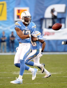
The greatest thing to happen on Sunday was when Patrick Crayton and the rest of the Chargers wore their powder blues. Photo by Getty Images

It was what we were all waiting for all season … the appearance of the best uniform in all of sports. The San Diego Chargers wore their powder blue uniforms!!

I’m sure we all heard the roars in the streets across the nation at 4 p.m. Eastern Time when the Chargers took the field in these wonderful uniforms. Unfortunately, San Diego’s play on the field couldn’t match how sharp it looked.

The uniform originates from the jersey introduced in the 1968 season and has evolved into an alternate when the Chargers went back to a white helmet in 2007.

The primary difference between the alternates the Chargers wore Sunday and the throwbacks are the numbers on the helmets that are featured prominently in the throwbacks. The alternates also feature a sleeker bolt that are places lower on the shoulders than the throwbacks.

Both looks are extremely stellar because of the combination of the powder blue with the yellow bolts on the pants and on the shoulder pads. The games is just enjoyable to watch when San Diego decides to go with this combination.

San Diego also goes a great job of adjusting their field to go along with the uniforms. Their end zones are painted the same powder blue as the uniforms. They also change the end zone design to go along with the logo used in the 60s.

What’s the best about this game is it featured another Tim Tebow comeback so it is sure to be played over and over again on ESPN for the rest of the week.

Now, we’ll move into our quick hits:

Tony Romo seemed to be pretty pumped up to be wearing these throwbacks on Thanksgiving. Photo by Getty Images

  • The Cowboys went with their traditional Thanksgiving throwbacks. These feature white helmets and white pants to go along with a blue uniform. Unlike the Cowboys usual dark blue uniforms (which are awful) these work well and are especially good for Thanksgiving.
  • The Ravens went with black jerseys for their Thanksgiving victory over the 49ers. I usually like the black for the Ravens, but they look much better with black pants instead of the white they went with on Thursday.
  • The Lions did not go with their usual Thanksgiving look. Maybe that’s what Ndamukong Suh was so angry about.


Week 11 NFL review: That’s all I can say

This was the perhaps the quietest week in NFL uniforms all season. The only changes came from the small details, that I’ll just discuss in short form here.

Maybe if the Redskins had stuck with yellow pants, Graham Gano would have felt inspired to hit a potential game-winning field goal in overtime. Photo by Getty Images

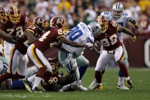
  • The Redskins who have gone with yellow pants to match their red home jerseys went with white pants in an overtime loss to the Cowboys on Sunday. I loved the yellow pants and was almost as sad to see them go as I was to see the Cowboys beat Washington and move into a first-place tie with the Giants.
  • The Rams looked sloppy again in uniforms and on the field with this all-blue look against the Seahawks.

Week 10 NFL review: When will they learn?

Mark Sanchez and the rest of the Jets had a very tough time in their biggest game of the season while wearing white at home. Photo by The Star-Ledger

Last week, the Buffalo Bills tried to pull off a uniform stunt by wearing white at home for a big game with the Jets. It failed … miserably.

So when the Jets were faced with their own big home game against the Patriots of course they wouldn’t fall into this same bad uniform karma, but no, they did.

The Jets came out of the tunnel at MetLife Stadium wearing all white, and from the outset, it did not work.

Granted, the Jets did defeat the Patriots in white at home in 2010, but that came early in the season when many teams choose to go with white at home. This one came in the middle of the season, and was clearly an attempt at creating more hype because of the uniforms.

One would think the Jets would have seen the disaster this move caused for the Bills, who still haven’t recovered, but their stubbornness caused problems in their biggest game of the season. For big games like this, it is my belief that a team should stick with the uniform that got it there.

No need to change things up just for the start of these games. Try to treat it as business as usual at least externally, teams that admit they are in big games with their uniforms usually have a tough time living up to the hype.

Bad job by the Jets all-around. Now, quick hits:

Quarterback Josh Freeman and the Bucs had a very tough time getting anything going in a sloppy look against the Texans. Photo by Getty Images

  • The Bucs looked sloppy in their uniforms and on the field with white pants to go with their red jerseys. The gold on red look is much more solid.
  • The Rams also had a very poor look of blue-on-blue in a close victory over the Browns. Still always hoping they go with their gold pants.
  • Atlanta broke out their awesome throwbacks for a loss to the Saints. By far the best uniforms the Falcons have ever worn.

Week 9 NFL Review: When uniforms flop

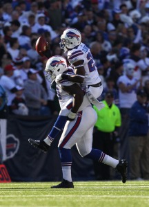
Marcell Dareus and the rest of the Bills might have had their moments on Sunday, but overall their white uniforms failed in a loss to the Jets. Photo by Getty Images

My apologies for the delay on this. Time constraints call for me to keep this brief, but more will come next weekend.

The Buffalo Bills tried to rally their team and their fans with a white out at Ralph Wilson Stadium on Sunday. For anyone who watched the game, it’s very fair to say, it flopped.

There was more emotion from the fans at the start of the game given this extra boost from a special uniform worn against a division rival.

However, since this idea did not work out as planned in a blowout loss to the Jets, it is likely the Bills will stay away from white at home for a while. Uniform karma could likely come back to bit the Bills if they continue to try something that hasn’t worked in the past.

A Bill friend of mine hopes to never see these again, and I will say I hope the Bills can turn things around as this season holds the most promise in a long time for the franchise.

Bills going with white at home

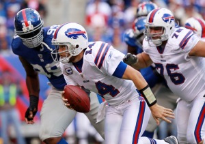
Ryan Fitzpatrick and the rest of the Bills will wear white at home against the Jets this Sunday. Photo by Getty Images

For this Sunday’s important matchup with the Jets, the Bills have announced they will wear white at home for the first time in 25 years.

This is pretty shocking news. In my lifetime, the Bills have not gone with this look. The Bills uniforms this season are among the best in the league, and the road look is slightly better than the home one.

I’m not a fan of white at home, but let’s see how it works for Buffalo.

Week 8 NFL review: Color coordination

All of Reliant Stadium got into the red act for the Texans victory over the Jaguars on Sunday. Photo by Getty Images

This week’s action in the NFL was a rare instance of more excitement with uniforms than their college counterparts.

It starts with the Houston Texans who used their alternate red in a victory over the Jacksonville Jaguars. The best part of this was not the jersey itself, but the fact that the rest of the stadium went along with this red revolution.

Houston must have gotten the word out to its fanbase of the uniform change because just about every fan in Reliant Stadium was going right along with their Texans in their red jerseys. Even the end zones had a red shadow to the letters instead of the usual blue.

Other teams, like the Jets, go with their alternate uniforms without changing anything else about their surrounding area. The Texans got it right in this case with a total feeling of red throughout Reliant Stadium.

The look isn’t good or bad, but just average. I prefer the normal blue uniform to this red look, but was very happy to see the rest of Houston going along with their team in the alternative direction.

Usually this color coordination is seen in the NHL and NBA playoffs. It seemed like just about every team in the NBA decided to go with this cool television effect this past postseason. The Heat are known for their white outs including the white drapes over the empty courtside seats.

With that, time for the quick hits:

A.J. Feeley and the rest of the Rams looked good and played even better against the Saints on Sunday. Photo by Getty Images

  • The Rams went back to their glory days in the uniform department and on the field as they went to throwbacks for an upset of the Saints. These uniforms are the best the Rams have ever worn, it was great to see them used again.
  • Carolina continued to employ its powder blue home jerseys. It makes me wonder if these have become the primary uniforms for the Panthers.
  • The Broncos also went with their alternate orange uniforms. The orange harkens back to the Orange Crush and John Elway days. The look is a bit jarring at first, but I think it definitely works for Denver.