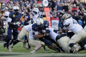
Kriss Proctor was the primary runner for Navy, and he was the quarterback. Most of the ground action looked pretty neat in Nike Pro Combat uniforms. Photo by Getty Images
Let me first say I love the Army-Navy game, absolutely love it. Call me old-fashioned, but to me, there’s something special about all the cadets and midshipmen entering the stadium in formation and the president switching sides of the field at halftime.
The game is simple, it’s what college football used to be, and to me, that is very cool. The triple option is the only play run and while both teams are not playing for a BCS game, their fans (and the players) are truly emotionally invested in the outcome.
Now, this season the game was given a little extra boost when the teams ran out of the tunnel. The uniforms were different than the usual.
The best part of these uniforms came in the details. And we’ll start with Navy, who made the biggest splash.
The Midshipmen usually have a simple look of blue with gold pants and a simple gold helmet. They have changed up the look in recent years for the Army game, but nothing like the drastic change they made to the helmet this year.
Navy came out with a white helmet featuring the Navy logo in gold. There was also a thick stripe down the center of the helmet, giving it that signature Pro Combat look.
It was a little stunning to see Navy come out looking slightly different than usual, but it was definitely something I got used to as the game progressed. The logo was neat to see prominently displayed, and the tapper at the back of the stripe was kind of neat too.
Perhaps the best feature to this uniform was the one that went unseen by those watching on television. Under the uniforms was a stars-and-stripes shirt with the words, “Don’t Tread on Me” written across the chest. Army also had a similar shirt, but it was far more simple.

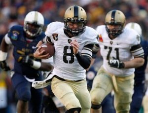
Army quarterback Trent Steelman looked cool with this awesome font in Saturday's Army-Nay game. Photo by Associated Press
Now on to Army’s uniforms. I always liked Army’s uniforms in general. They are simple and the black with gold always is a nice combination. The Black Knights have gone to a camouflage for a recent Army-Navy game, and frankly, that just seemed a little strange for a football game.
For Saturday’s game, I really like the font for the numbers on Army’s uniforms. The thick black stripe on the matte-finish gold helmet was cool to see.
The best part of the uniform was the shoes. Army was sporting these gold shoes that went very well with the gold pants they had. Here’s a closer look at everything the Black Knights chose yesterday.
The Army-Navy game always has just the right pageantry for a college football game, and in this case, the uniforms struck just the right chord to match the game.
