Rutgers looking more like Knights

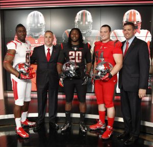
Rutgers football will have a brand new look this upcoming season. It is a move toward looking like the Scarlet Knights they are named after. Photo by The Star-Ledger

Over the past few seasons, Rutgers football started to cause a stir in the uniform world with some black alternate jerseys, but Tuesday, the Scarlet Knights took it to another level.

Rutgers showed off their new threads in a televised uniform reveal in the SNY studios in New York City, and they’re significantly different than anything they’ve worn before.

Director of Athletics Tim Pernetti explained the uniforms as a move to look more like knights. Without that explanation, you might think it looks like Rutgers is ready to jump in a spaceship and head to the moon.

The silver helmets might give the opponents a hard time during day games because of the intense reflection of the sun. They’re supposed to look like the helmets of knights, and with that explanation, the helmets are not as offensive as first thought.

The primary problem I have with the helmets is the thick stripes that go over the top of the helmet. They’re unnecessarily huge and have become the trademark of these new Nike college football uniforms.

The uniforms themselves aren’t  too bad. I like the all-white for road uniforms and all-red for the home garb. The numbers bother me a little bit just because silver numbers can become distracting while watching games.

It should be interesting to watch these uniforms in action this fall.

Here’s a full photo gallery of the uniforms courtesy of The Star-Ledger.

Nike takes the NFL

Nike's Todd Van Horne and the Seahawks' Kam Chancellor helped usher in a new era of Seattle's uniforms at the big Nike reveal yesterday. Photo by the New York TImes.

Now that we’ve had some time to let the Nike uniform revolution wash over us for a day, it’s time to settle down and think about what the NFL will look like come September.

In reality, there is not too much to get excited about here. The changes aren’t as dramatic as many thought they would be considering Nike’s history with crazy uniforms.

For the most part, teams will be changing their collars a bit to accommodate the flywire collars that became a trademark for Nike uniforms during last college football season. I never really understood why these collars needed to be used, but it seems to be a characteristic Nike likes to use for their uniforms.

The one team that went over the edge with their uniforms was the Seattle Seahawks.

There must be something about the Pacific Northwest that inspires teams to go for crazy uniforms, but it all started with Oregon and is now making its way to Seattle.

My biggest problem with Seattle’s news uniforms is the fact that there is just so much going on with them. I am usually in favor of intricacies to the uniforms, but the Seahawks take it too far.

The shoulder pads alone have at least four features to them, it’s impossible to keep track of all that as the game is going on.

The font on the numbers is pretty weak, it makes the uniform look too much like a college team. However, upon closer inspection, you can see the numbers have a pattern on them, but unless you are tackling Marshawn Lynch, it might be tough to notice that.

One feature I do like on the Seahawks new uniforms is the same pattern along the pants. I always thought the Seahawks pants were a little simple and could have used an extra stripe. Now, they have added that despite ruining the rest of the uniform.

Here is the photo gallery the Seahawks posted if you’re interested in exploring the new uniforms any further.